Pirate Café
Branding & Visual Identity
“Elegance Anchored in Tradition, Adventure Awaits”
Pirate Café is a captivating culinary destination that seamlessly marries the allure of a vintage Parisian brasserie with the contemporary elegance of a modern dining experience. Nestled within its walls, guests are transported to a bygone era of glamour and sophistication while enjoying impeccable service that warms the heart. The restaurant is an enchanting fusion of old-world charm and modern sophistication.

Branding #1 Unveiled
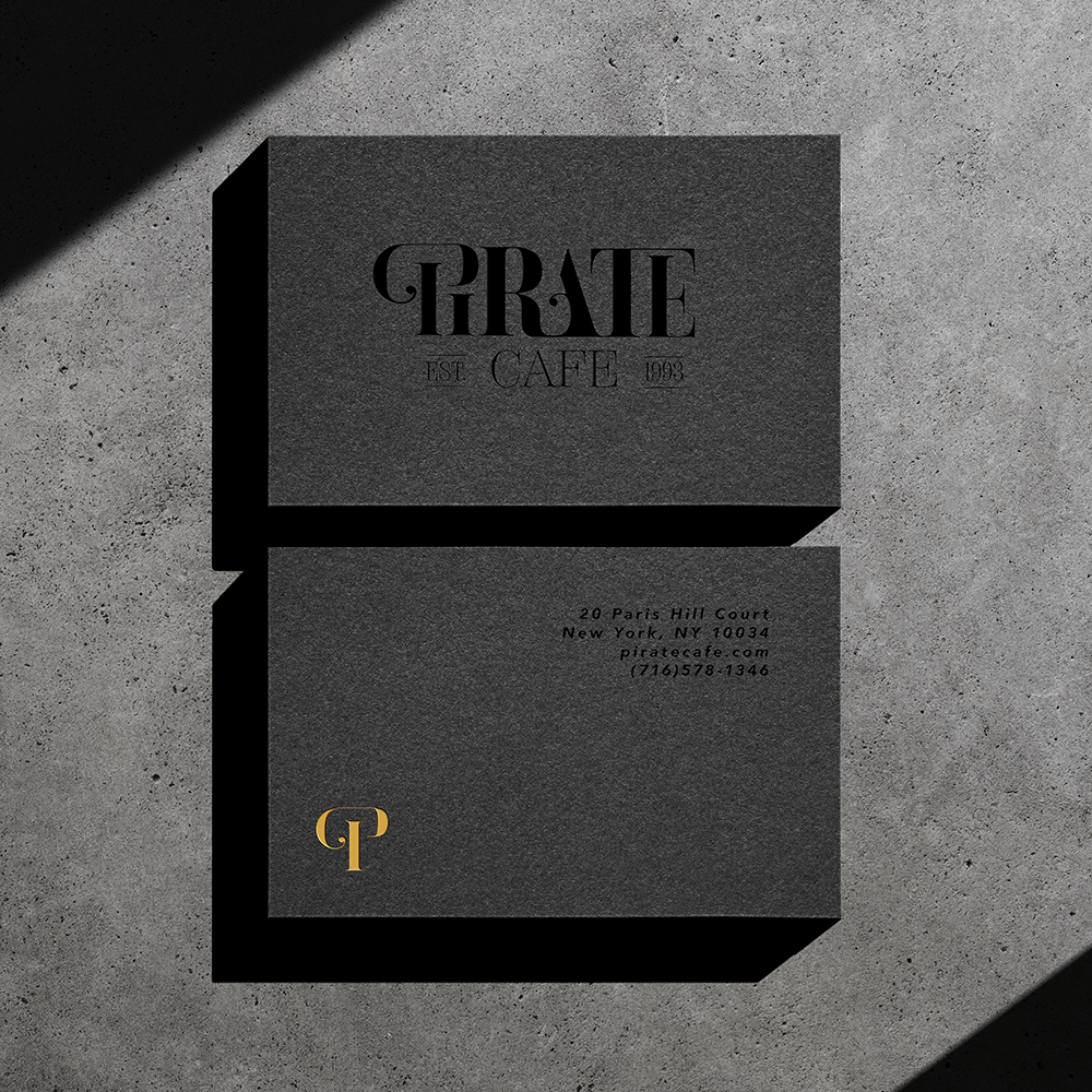
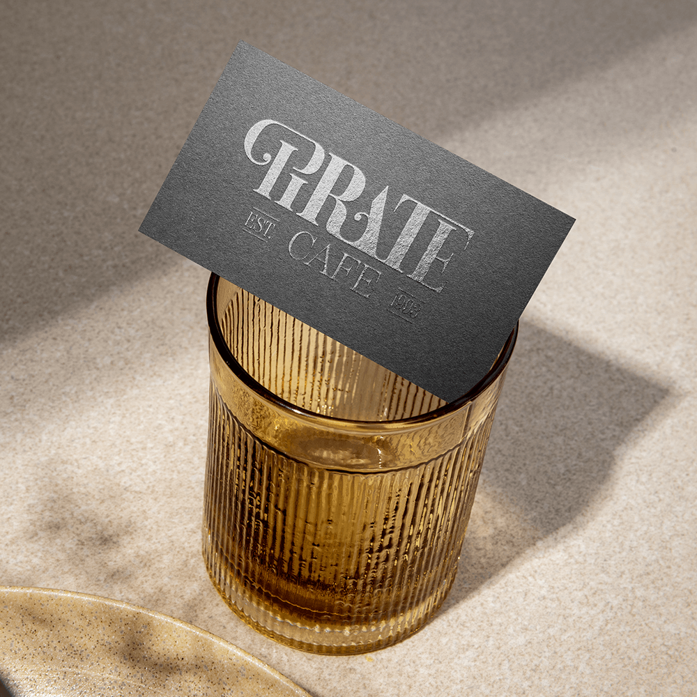
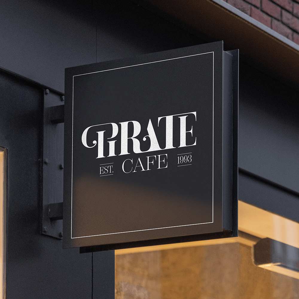
Pirate Café’s visual identity is a captivating fusion of Parisian elegance and adventurous spirit, reflecting the duality of their concept. Here’s how their brand visual identity comes to life:
- Logo: The typography is elegant yet bold, with a hint of whimsy, representing the restaurant’s sophisticated yet adventurous personality.
- Colour Palette: Their colour palette combines rich, deep tones with vibrant accents. Deep navy blue evokes the mystery of the sea and the spirit of adventure, while accents of gold and burgundy add a touch of luxury and sophistication.
- Interior Design: The space is designed to evoke a sense of wonder and enchantment, inviting guests to embark on a culinary voyage unlike any other.
- Graphics and Imagery: Imagery is carefully curated to showcase the beauty and diversity of our culinary offerings, with a focus on bold colours, enticing textures, and mouth-watering presentations.
- Culinary Excellence: They are dedicated to culinary craftsmanship, sourcing the finest ingredients and crafting each dish with precision and creativity.
- Adventure: Adventure is at the heart of Pirate Café. They celebrate the thrill of discovery, offering a menu that combines classic French recipes with exotic flavours and unexpected twists.
- Elegance: Inspired by the timeless allure of Parisian style, they infuse every aspect of Pirate Café with an air of sophistication and refinement.
- Hospitality: At Pirate Café, hospitality is more than just a service – it’s a way of life. They treat every guest like royalty, welcoming them with genuine warmth and attentiveness.
The goal of Pirate Café’s new visual identity is to create a memorable and immersive brand experience that resonates with their audience and sets them apart in the competitive culinary landscape. Here’s how their visual identity aligns with their objectives:
- Distinctive Brand Recognition: By combining elements of Parisian elegance and adventurous spirit in our visual identity, they aim to create a brand image that is instantly recognisable and stands out in the minds of consumers. Their unique blend of themes and aesthetics sets them apart from traditional restaurants, sparking curiosity and intrigue among potential guests.
- Cohesive Brand Storytelling: The visual elements of their brand, from the logo to the interior design, work together to tell a cohesive story that reflects our culinary concept and values. Through our imagery and branding collateral, we communicate the narrative of a culinary voyage where sophistication meets exploration, enticing guests to embark on this journey with us.
- Enhanced Guest Experience: Their visual identity is designed to enhance the overall guest experience, creating a welcoming and immersive atmosphere that captivates the senses. The thoughtfully curated interior design, branding collateral, and graphics all contribute to a memorable dining experience that goes beyond just the food, leaving a lasting impression on our guests.
- Brand Consistency Across Touch points: Consistency is key to building a strong brand identity, and their visual elements are carefully implemented across all touch points, from physical spaces to digital platforms and marketing materials. This ensures that every interaction with the Pirate brand reinforces their core values and leaves a consistent impression on our audience.
- Attraction of Diverse Audiences: By embracing a visual identity that blends classic elegance with adventurous flair, they aim to appeal to a diverse range of audiences. From food enthusiasts seeking innovative culinary experiences to travellers looking for a unique dining destination, their visual identity communicates an inclusive and welcoming atmosphere that attracts guests from all walks of life.
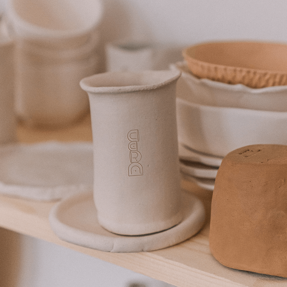
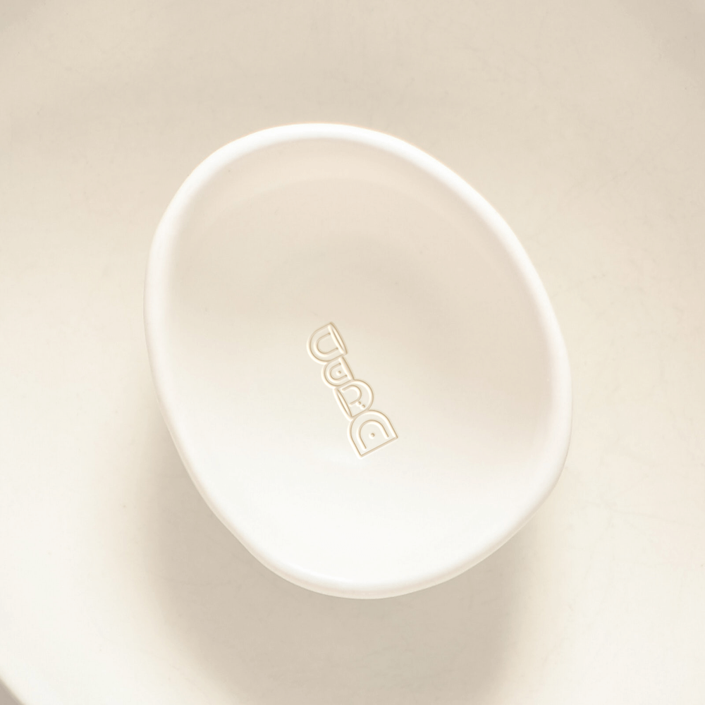
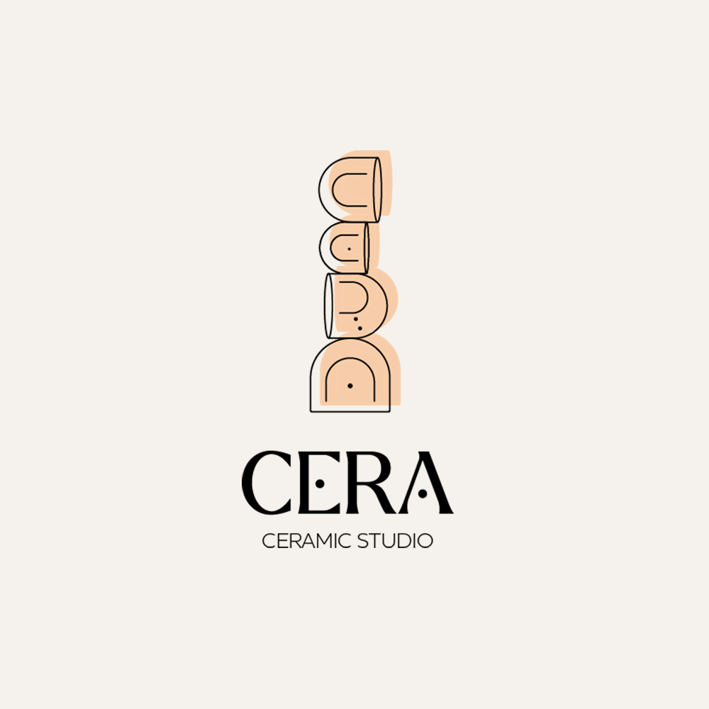
CERA
Branding & Visual Identity
“Elevate Everyday Moments”
CERA is a celebration of artistry and craftsmanship, where every piece tells a unique story of creativity and passion. Each hand-crafted ceramic item embodies the essence of timeless beauty and functionality, meticulously crafted to elevate everyday moments with a touch of elegance and charm. With a commitment to quality and artisanship, CERA offers a collection of exquisite ceramics that add warmth and character to any home or space.
Branding #2 Unveiled
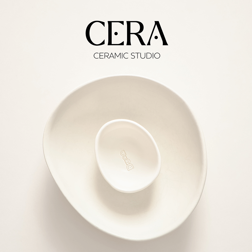
CERA’s visual identity embodies its values of craftsmanship, authenticity, and connection, reflecting warmth and organic beauty. Key elements include:
- Logo: Minimalist design with “CERA” in a timeless serif font, possibly with subtle hand-drawn elements. Simple, abstract icons of ceramic vessels accompany the logo, emphasising handmade craftsmanship.
- Colour Palette: Inspired by nature with warm, earthy tones like terracotta and sandy beige. Soft neutrals like ivory balance the palette, with occasional metallic accents for luxury.
- Typography: Clean, modern sans-serif font for body text, reflecting authenticity and simplicity. Selective use of handwritten or script fonts adds a personal, artisanal touch.
- Imagery: Highlights the beauty and craftsmanship of ceramics in natural settings. Close-up shots showcase textures and imperfections, while lifestyle photography depicts everyday rituals with CERA ceramics at the center.
- Craftsmanship: At CERA, they deeply value the art of craftsmanship. Each piece is lovingly handmade by skilled artisans, using time-honored techniques passed down through generations. They take pride in the attention to detail and precision that goes into every creation, ensuring that each ceramic item is a true work of art.
- Authenticity: Authenticity is at the core of everything they do. They believe in transparency, integrity, and honesty in our craftsmanship, materials, and business practices. Their ceramics are made with natural, sustainable materials, and they strive to foster genuine connections with their customers based on trust and mutual respect.
- Connection: CERA is committed to fostering meaningful connections—between people, cultures, and the natural world. Their ceramics serve as vessels for shared moments, whether it’s enjoying a meal with loved ones, savouring a quiet moment of reflection, or connecting with the earth through handmade craftsmanship. They believe in the power of ceramics to create connections that enrich and inspire lives.
CERA’s new visual identity aims to:
- Establish brand differentiation by emphasizing handmade craftsmanship, authenticity, and connection.
- Elevate brand perception as a premium, artisanal brand through warm tones and sophisticated design.
- Forge deeper connections with consumers who value authenticity and mindfulness in their purchases.
- Increase brand recognition and recall by maintaining consistency across all touchpoints.
- Facilitate expansion and growth by effectively communicating core values and appealing to diverse demographics.
Karine Van de Plas
Branding & Visual Identity
“Your Legal Journey, Our Expertise”
Karine, a driven and accomplished young woman, is the visionary behind Van de Plas, a law firm in the heart of Brussels. With a fervent commitment to delivering exceptional legal services, Karine has founded a practice that embodies professionalism, innovation, and a deep understanding of the intricacies of Belgian law.
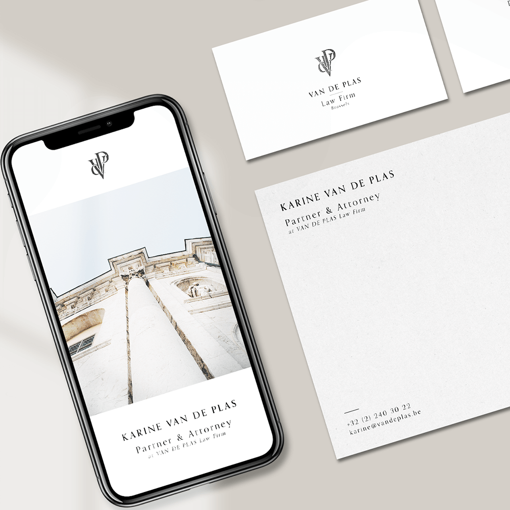
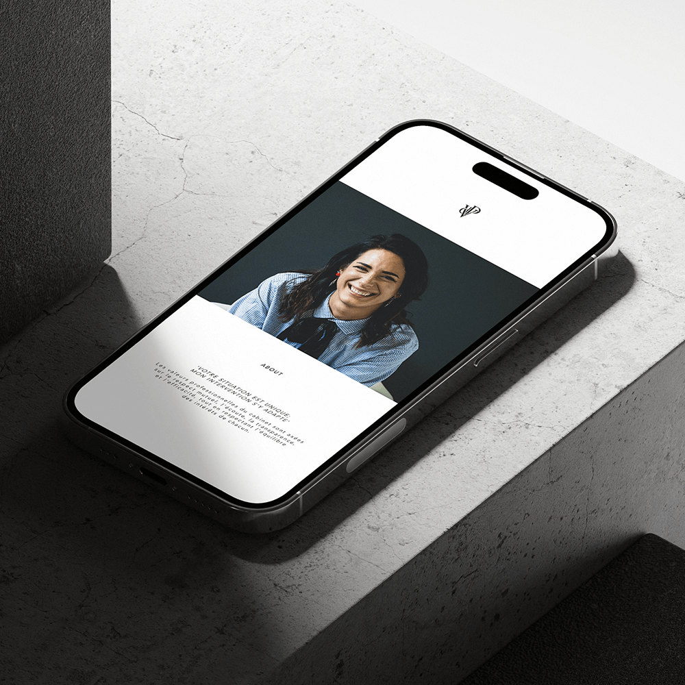
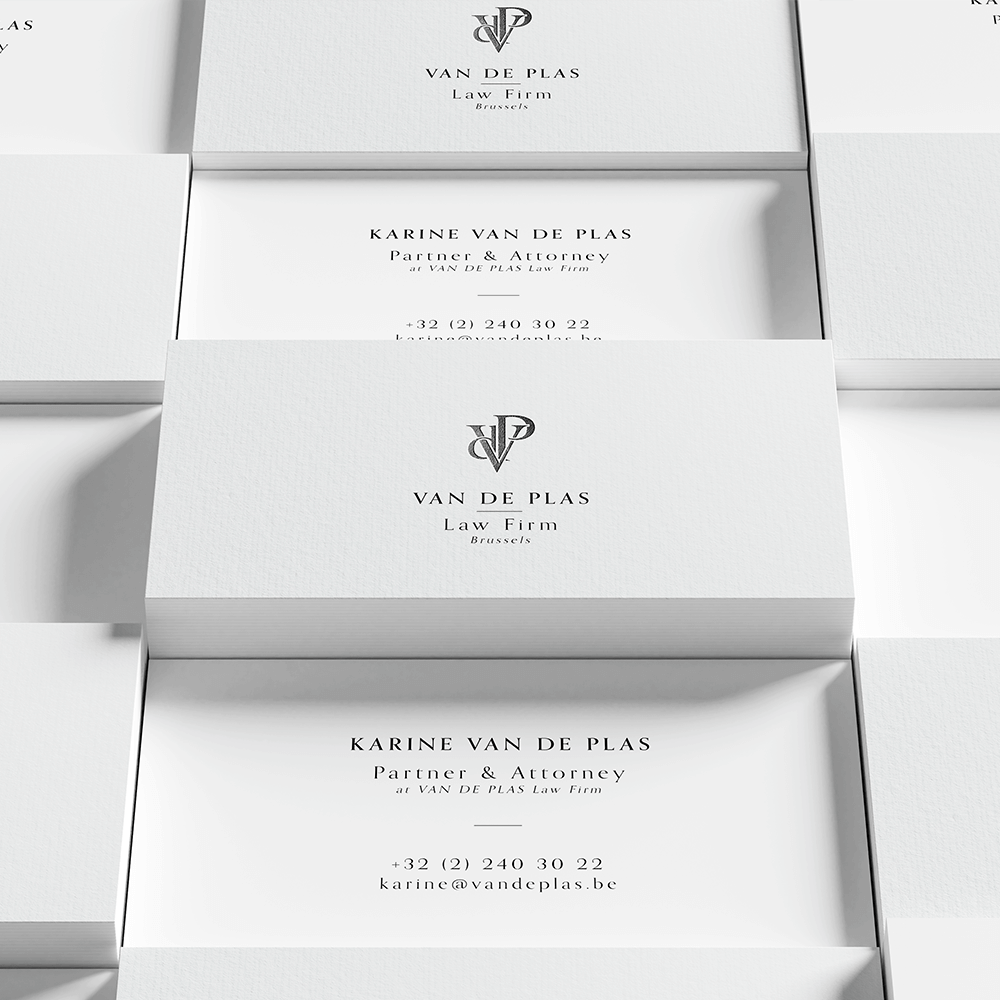
Branding #3 Unveiled
For Karine Van de Plas, founding her law firm in Brussels means embodying these core values:
- Excellence: Striving for the highest legal standards and delivering top-quality representation.
- Integrity: Operating with honesty, transparency, and ethical conduct in every interaction.
- Client Centered Service: Prioritising clients’ needs with personalised, compassionate attention.
- Empathy and Understanding: Providing a supportive environment based on empathy and respect.
- Community Engagement: Giving back through pro bono work and civic involvement for societal impact.
For Karine Van de Plas’s law firm to stand out in Brussels:
- Professionalism and Trust: The visual identity must convey reliability and integrity, instilling confidence in clients.
- Modern Elegance and Tradition: Balancing contemporary expertise with timeless values, the logo should blend solidity with forward-thinking elements.
- Strength and Expertise: Symbolising stability and legal prowess, the logo highlights the firm’s proficiency and reliability.
- Excellence and Integrity: Sophisticated typography and design underscore the firm’s commitment to high-quality service with ethics.
- Attracting Diverse Clients: Emphasising inclusivity and approachability while maintaining professionalism attracts clients from various backgrounds.
- Differentiation: Showcasing a unique blend of modernity, tradition, expertise, and integrity sets the firm apart in Brussels’ legal marketplace.
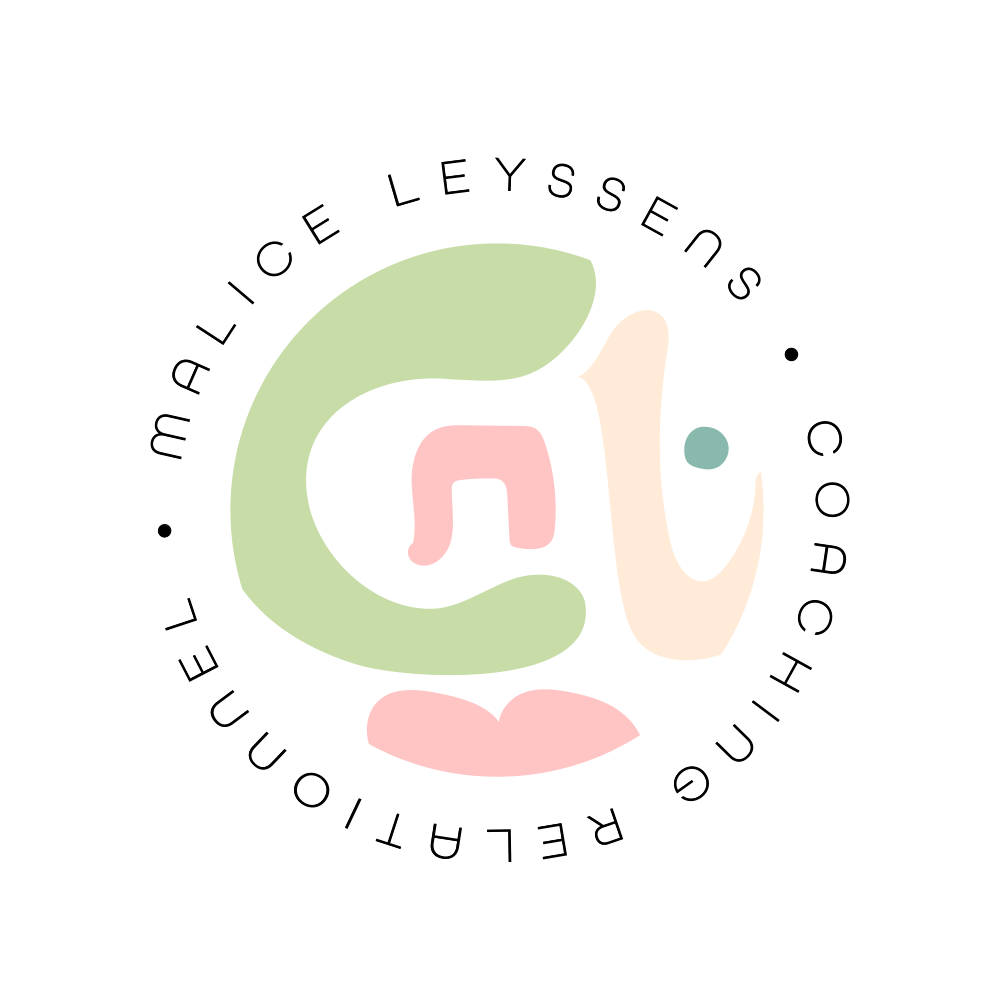
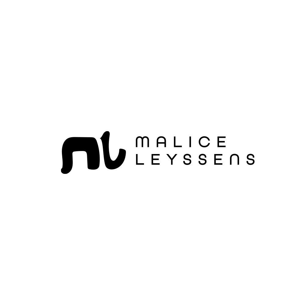
Malice Leyssens
Branding & Visual Identity
“Nurturing Growth, Fostering Change – Your Journey to Wholeness Begins Here.”
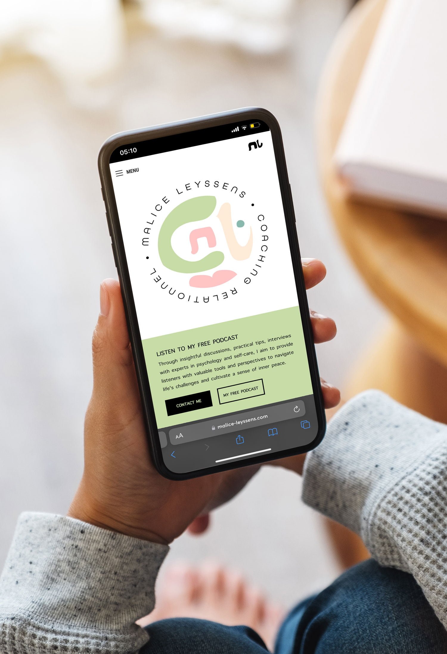
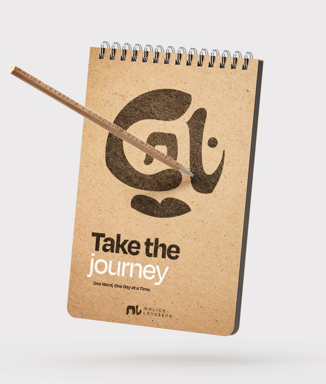
Malice Layssens Coaching is a sanctuary for personal transformation, where the journey of self-discovery meets unwavering support. With a distinctive and nurturing identity, this coaching brand is dedicated to fostering profound personal growth, facilitating healing, and guiding individuals toward positive transformation. Malice Layssens, as your dedicated coach, creates a safe and supportive environment that empowers you to navigate life’s challenges, uncover your true potential, and embrace a journey of holistic well-being.
Branding #4 Unveiled
Malice Leyssens Coaching’s visual identity captures personal transformation and holistic well-being with:
- Logo: A hand-drawn human face symbolises growth and self-discovery, inviting clients on a nurturing journey.
- Colour Palette: Nature-inspired hues of greens, blues, and neutrals create a calming and renewing atmosphere.
- Typography: Clean sans-serif fonts offer clarity and accessibility, while handwritten elements add warmth.
- Imagery: Tranquil landscapes and introspective moments reflect empowerment and growth, inspiring clients’ own journeys.
Malice Leyssens coaching practice is guided by core values:
- Empowerment: Inspiring clients to make empowered choices and create positive change.
- Authenticity: Creating a safe, transparent space for clients to express their true selves.
- Compassion: Offering understanding, validation, and gentle support throughout each unique journey.
- Holistic Well-being: Emphasising balance and fulfilment across mind, body, and spirit.
- Courage: Encouraging clients to embrace growth by confronting challenges with courage.
- Empathy and Understanding: Providing a supportive environment where clients feel heard and valued.
- Continuous Growth: Committing to personal and professional development alongside clients’ journeys.